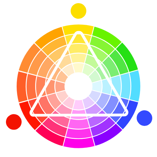
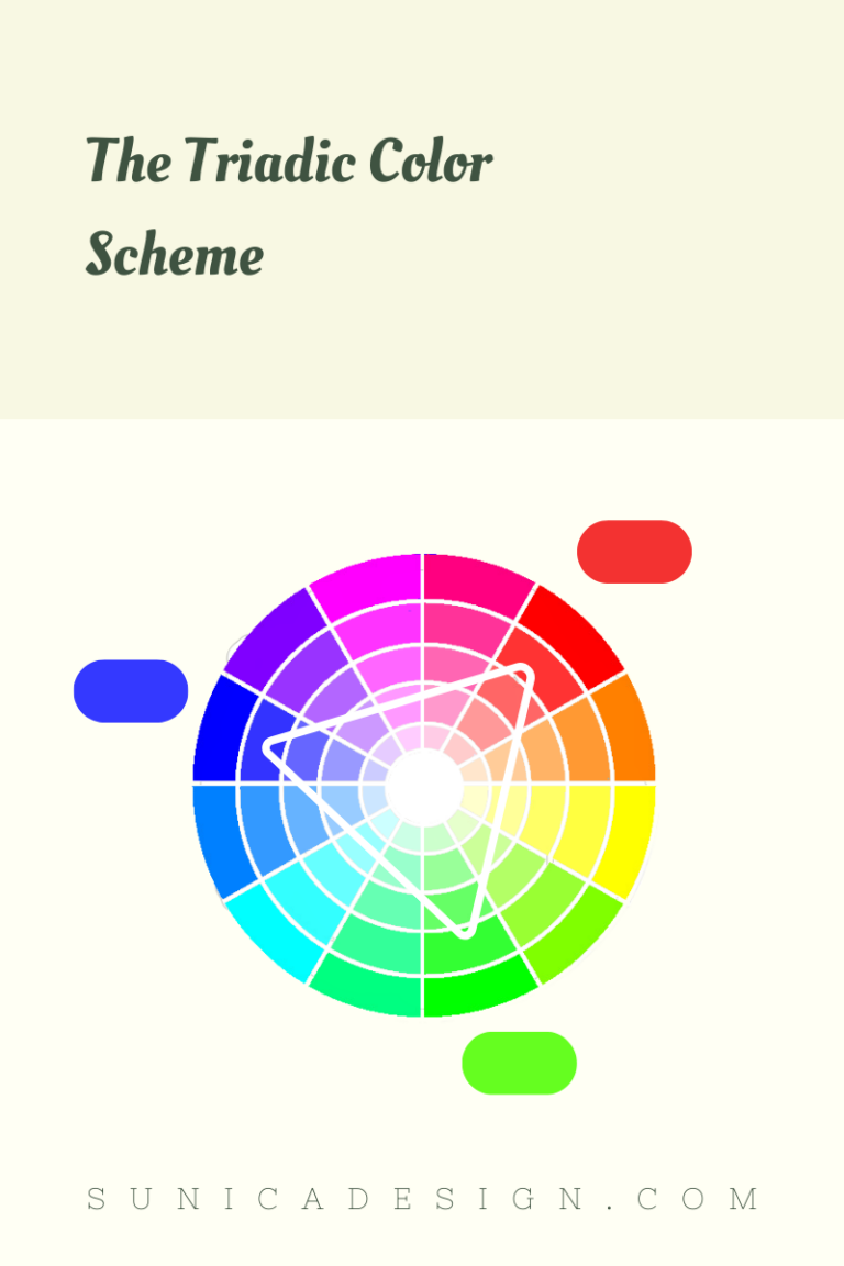
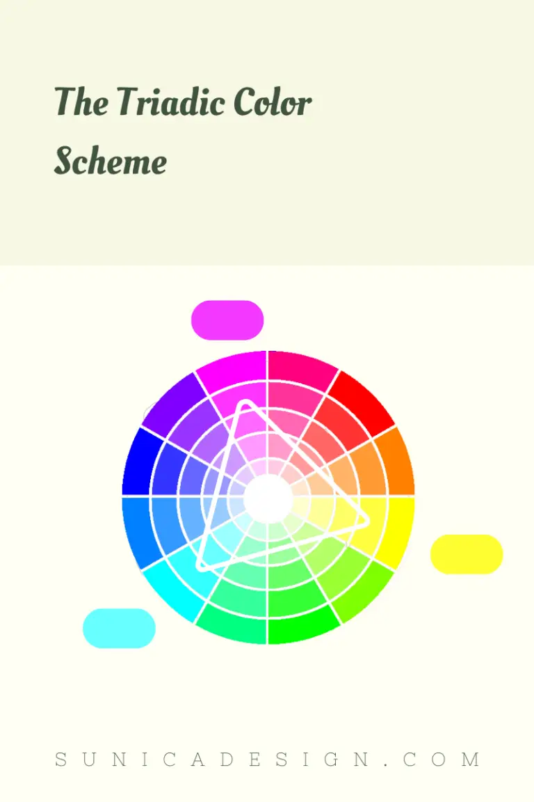
 A triadic color scheme is a special split-complementary color scheme. It involves three colors equally spaced around a color wheel, forming a perfect triangle. These colors create a vibrant contrast, yet they harmonize well.
For instance, think of primary colors in the RYB color wheel: red, yellow, and blue. They’re a perfect example of a triadic scheme. When using them, one color usually dominates, while the other two serve as accents. This balance ensures your design doesn’t feel too chaotic. You can also tweak the brightness and darkness of each color to achieve the desired effect.
Triadic color schemes involve three evenly spaced colors on the color wheel. However, this arrangement may yield different colors in divergent color wheels. Now let’s explore this color scheme in RYB, RGB, and CMYK color models.
In the RYB model, a color wheel favored by artists and painters, a common triadic scheme might consist of red, yellow, and blue. You could also use secondary colors—orange, green, and purple—as a triadic color scheme. These colors sit equidistant on the RYB color wheel, offering an eye-pleasing contrast while maintaining color unity.
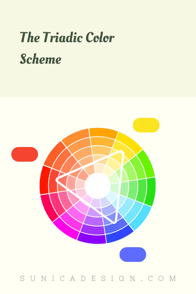
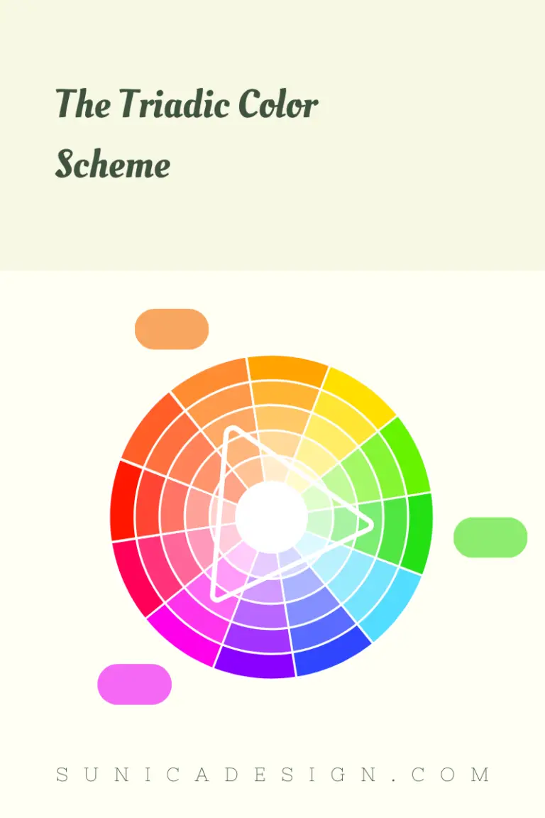
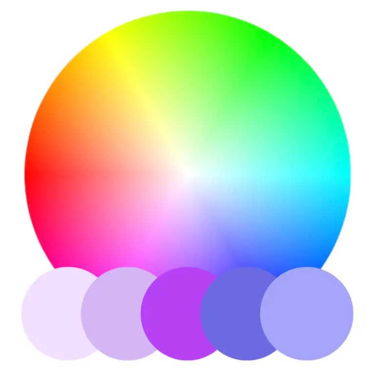
When it comes to RGB, the model primarily used in digital displays, a typical triadic color scheme would also be its primary colors: red, green, and blue. You might opt for secondary colors like cyan, magenta, and yellow as a triadic scheme. These colors appear evenly spaced on the RGB color wheel. When combined on a digital screen, they create a vibrant but balanced look, essential for visual design in digital formats.
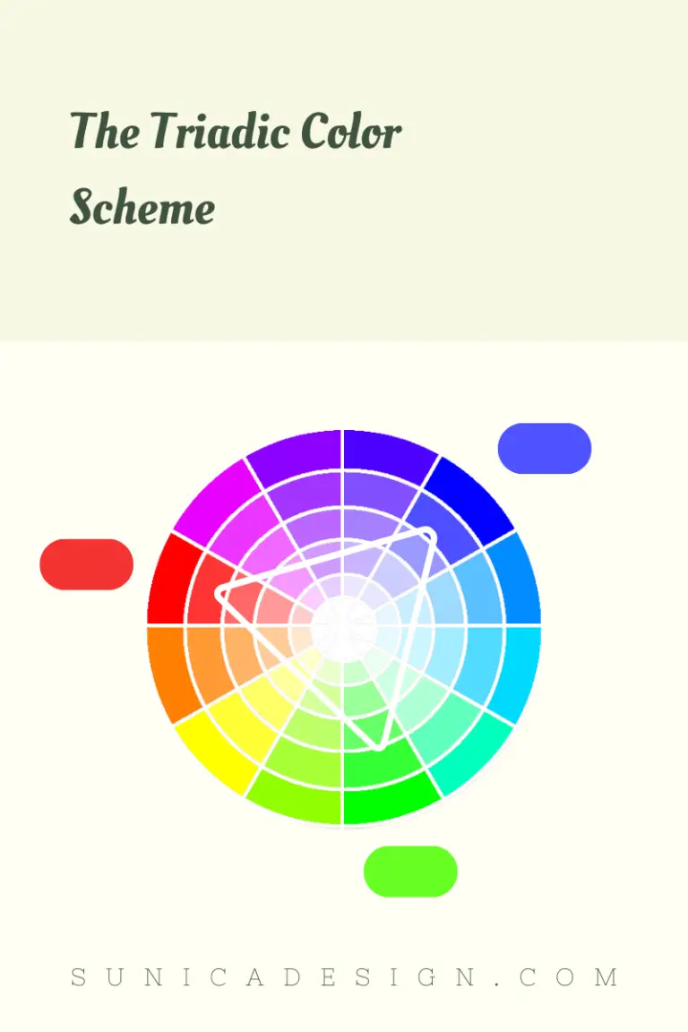
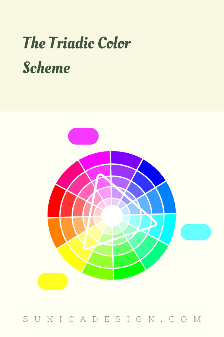
In the CMYK model, widely used in color printing, a triadic scheme could feature cyan, magenta, and yellow. You could also find red, green, and blue as another scheme.
Sounds similar to the RGB triadic combo, right? The overlap in triadic color schemes between RGB and CMYK stems from their foundational similarities. Both models serve as standard systems for digital and print color representation, and they share some common secondary and tertiary colors.
Consider cyan, magenta, and yellow. These colors are secondary in the RGB model and primary in the CMYK model. Their presence in both systems leads to shared triadic schemes.
Another reason lies in the conversion processes between the two models. Digital designs often go to print and vice versa. A level of consistency between the two systems is not just practical but essential for accurate color reproduction.
Here are some tips to guide you in effectively applying triadic colors:
By keeping these tips in mind, you’ll be better equipped to create engaging, balanced designs and artworks!
Copyright © Sunica Design. All Rights Reserved. This site is protected by reCAPTCHA and the Google Privacy Policy and Terms of Service apply.

Subscribe to our weekly newsletter and unlock: